
Most logos don't fail because they're ugly. They fail because they're trying to do too many things at once — communicate the business name, describe the services, look trendy, and please the entire management team simultaneously. Great logo design solves a different, simpler problem: making a brand instantly recognizable and deeply memorable.
Walk through any Moroccan business district or scroll through any startup's social media feed and you'll see a consistent pattern: logos that feel generic, over-designed, or disconnected from any clear brand strategy. Gradients, globes, abstract swooshes, and literal illustrations of whatever the company does — all executed competently enough, but creating no real impression, no differentiation, no lasting memory.
This isn't a reflection of poor design talent in Morocco. It's a reflection of poor briefs, misunderstood objectives, and a fundamental confusion about what a logo is actually supposed to do. This guide corrects that confusion and gives business owners a clear framework for understanding — and evaluating — great logo design.
What a Logo Is (And Is Not)
A logo is not meant to explain your business. It's not meant to communicate your values, describe your services, or tell your story. That's the job of your complete brand identity — copy, color, imagery, and voice working together. A logo has one job: to be instantly recognizable and to trigger the associations your overall brand has built in the minds of your audience.
Nike's swoosh says nothing about athletic performance. Apple's apple says nothing about technology. These marks work because the brand activities behind them have loaded them with meaning over time. A great logo is a container for meaning — not a generator of it on its own.
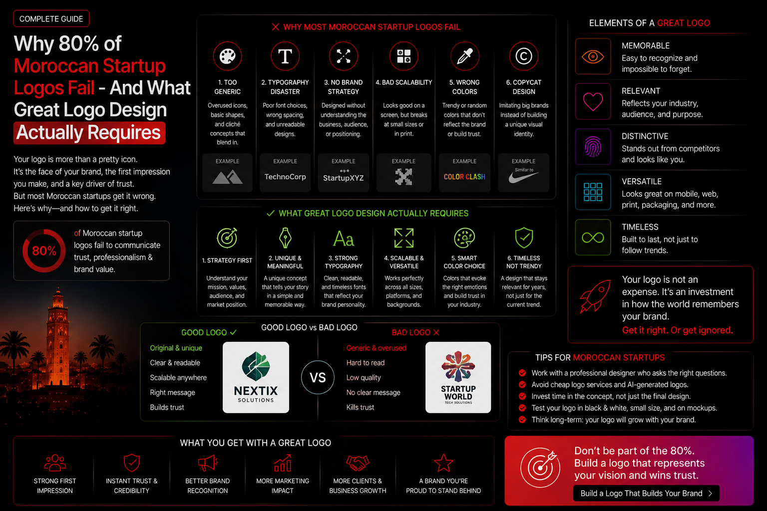
Why Most Moroccan Startup Logos Fail
❌ Designed by Committee
When every stakeholder gets a vote, logos accumulate elements until they become visual compromises that satisfy everyone and excite no one. The most iconic logos in history were almost always approved over significant internal resistance — because distinctiveness always makes someone uncomfortable.
❌ Trying to Explain Too Much
A software company with a logo featuring a circuit board, a human figure, and a globe rendered in three colors is trying to communicate its entire business in one mark. The result is a mark that communicates nothing clearly because it's trying to communicate everything at once.
❌ Chasing Trends Instead of Building Timelessness
The flat design trend, the gradient trend, the geometric minimalism trend — logos built to look current rather than to be distinctive age rapidly. The best logos look as relevant in 30 years as they do today because they were built on enduring principles rather than current fashion.
❌ No Strategy Behind the Design
A designer who hasn't been briefed on brand positioning, target audience, competitive landscape, and brand personality cannot make strategic design decisions. Without strategy, every visual decision is arbitrary — and arbitrary design produces forgettable results.
The 5 Principles of Great Logo Design
✅ Simplicity
The world's most recognized logos can be drawn from memory by a child. Simplicity is not a lack of creativity — it's the result of extraordinary creative discipline. Every element that can be removed should be.
✅ Distinctiveness
Your logo should look like nothing else in your category. The first question to ask of any logo design is: "Does this look like a competitor's mark?" If yes, start again.
✅ Versatility
A great logo works at every size — from a tiny favicon to a building-sized billboard — and in every context, including black and white reproduction. Test any logo design at 16px before approving it.
✅ Timelessness
Ask yourself: would this logo have looked reasonable 20 years ago, and will it look reasonable 20 years from now? Logos built for longevity avoid trend-dependent stylistic choices.
✅ Appropriateness
A great logo feels right for its brand — in tone, personality, and visual language. A children's education brand and an investment bank have very different requirements for what "appropriate" means.